Glyph Icons Explained: A Versatile Visual Language for Modern Digital Projects
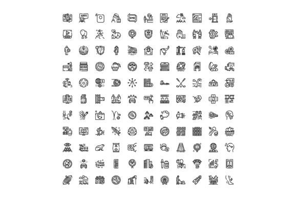
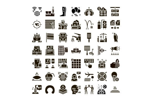
Glyph icons are minimalist, monoline, often monochromatic symbols designed to convey meaning quickly and universally. Unlike complex illustrations or detailed pictograms, glyph icons rely on clean geometry, consistent stroke weight, and intentional negative space to communicate ideas across languages, cultures, and devices. A well-crafted collection of various glyph icons—spanning communication, healthcare, transport, business, lifestyle, ecology, and digital services—serves as a foundational visual toolkit for designers, developers, educators, and brand strategists alike.
Why Glyph Icons Matter in Today’s Digital Landscape
In an era where attention spans average just 8 seconds, clarity and speed of recognition are non-negotiable. Glyph icons meet this demand by acting as visual shorthand. They reduce cognitive load, accelerate navigation, and improve accessibility when paired with proper labeling and contrast. Whether embedded in a mobile health app, an eco-conscious brand’s website, or a public transit dashboard, glyph icons bridge the gap between function and familiarity.
Unlike decorative icons or custom illustrations, glyph icons prioritize versatility and scalability. Their simplified forms render crisply at any size—from 16px buttons to large-scale infographics—and adapt seamlessly across dark mode interfaces, print materials, and responsive layouts.
What Makes a Collection of Glyph Icons Truly Useful?
A high-quality set of glyph icons goes beyond aesthetics—it’s built with intention, consistency, and real-world application in mind. Here’s what sets exceptional collections apart:
- Thematic breadth: Covering domains like healthcare (e.g., stethoscope, heartbeat, telemedicine), transport (e.g., bus, bike share, EV charging), and ecology (e.g., recycling loop, leaf, water drop) ensures relevance across industries.
- Design coherence: Uniform stroke width, consistent corner radius, aligned baselines, and harmonized proportions allow icons to work together—not just individually.
- Technical readiness: SVG format support, accessible naming (ARIA labels), and multi-format exports (SVG, PNG, Figma, Sketch) make integration into web, app, and branding projects frictionless.
- Cultural neutrality: Avoiding region-specific symbols (e.g., mailboxes shaped like U.S. blue boxes) ensures global usability—critical for SaaS platforms and international NGOs.
Practical Applications Across Industries
Let’s explore how these versatile icons operate in everyday contexts:
Communication & Digital Services
From chat bubbles and video call symbols to cloud upload and notification bells, communication glyphs streamline user interaction. In a remote-work collaboration tool, a subtle “hand-raising” glyph next to a participant’s name signals intent to speak—replacing text instructions and reducing clutter. These icons don’t just decorate; they orchestrate flow.
Healthcare & Wellbeing
Health apps and telehealth portals rely on intuitive, trustworthy iconography. A carefully drawn pill icon with subtle cross-hatching conveys medication without ambiguity; a heart-rate waveform glyph—clean and rhythmic—signals vital monitoring more effectively than abstract shapes. Importantly, healthcare glyphs avoid unintended associations (e.g., using red sparingly to prevent alarm triggers) and align with WCAG contrast standards for low-vision users.
Transport & Urban Mobility
Public transit maps, ride-share interfaces, and smart city dashboards use transport glyphs to unify complex systems. A unified “bike + bus + train” icon set helps commuters instantly compare multimodal options. Unlike stylized illustrations, glyph icons remain legible on small screens—even in motion—making them ideal for real-time arrival boards and navigation overlays.
Business & Productivity
Project management tools, CRM dashboards, and financial reporting platforms use business glyphs to encode concepts like “approval,” “timeline,” “analytics,” or “team.” A checkmark inside a shield, for example, subtly communicates “verified data”—a fusion of action and security that words alone would require sentences to explain.
Lifestyle & Daily Habits
Wellness apps, habit trackers, and educational platforms use lifestyle glyphs to humanize routines: a sun for morning rituals, a book for learning, a yoga pose for mindfulness. These aren’t mere decorations—they serve as visual anchors that reinforce behavioral cues and emotional resonance.
Ecology & Sustainability
As climate literacy grows, so does demand for clear environmental iconography. A glyph showing a circular arrow around a leaf expresses “closed-loop recycling”; a water droplet merging with a tree root signals “water conservation.” These icons empower sustainability reports, green product labels, and school curricula—turning abstract values into tangible, teachable visuals.
Common Misconceptions About Glyph Icons
Despite their widespread use, several myths persist:
- “All icons are interchangeable.” Not true. A “cloud” glyph might mean storage in one context and weather in another. Context, labeling, and testing with real users determine whether meaning lands—or confuses.
- “Simpler always means better.” Oversimplification can erase nuance. For example, a generic “person” glyph may fail to represent diverse abilities, ages, or identities. Inclusive design means thoughtful variation—not just one universal figure.
- “Glyph icons replace text.” They complement it. Best practices recommend pairing icons with visible labels—especially for low-frequency actions or critical functions like “delete account” or “emergency contact.”
- “Any vector drawing qualifies as a glyph.” True glyph icons follow strict design systems: consistent metrics, optical alignment, and purpose-built spacing. Random SVG exports lack the rigor needed for professional scalability.
How to Choose and Use a Glyph Icon Set Effectively
Selecting the right collection starts with your project’s goals—not just its look. Ask yourself:
- Will these icons appear in both light and dark UI modes? Ensure the set includes tested contrast variants.
- Do you need multilingual support? Look for icons that avoid text-based metaphors (e.g., “OK” in Latin script).
- Is accessibility a priority? Confirm each icon has semantic HTML support and passes screen reader testing.
- Will developers integrate them via code? Prefer sets with CSS classes, React components, or icon fonts that support dynamic color and sizing.
Once selected, treat your glyph icons as part of your design system, not just decoration. Document usage rules: minimum size, acceptable colors, spacing guidelines, and prohibited combinations. This ensures consistency across teams—and builds trust with users who recognize reliable visual patterns.
Looking Ahead: Glyph Icons in an Evolving Digital World
As voice interfaces, AR navigation, and AI-powered dashboards grow, glyph icons won’t disappear—they’ll evolve. Future-ready sets already anticipate motion (subtle hover animations), interactivity (state-based variants like “on/off”), and personalization (modular glyphs that combine, e.g., a “user” base + “location” overlay). Moreover, generative design tools now let teams customize glyph families while preserving system integrity—blending brand uniqueness with universal comprehension.
Ultimately, a thoughtfully curated collection of various glyph icons is more than a download—it’s a shared language. It reflects empathy for users, respect for context, and commitment to clarity. Whether you’re launching a community health portal, designing a zero-waste brand identity, or building the next-generation transit app, these icons become quiet collaborators in making complexity feel simple, inclusive, and human.
Ready to explore a professionally crafted set of glyph icons covering communication, healthcare, transport, business, lifestyle, ecology, and digital services? Discover scalable, accessible, and beautifully consistent icons built for real-world impact—designed not just to be seen, but to be understood.