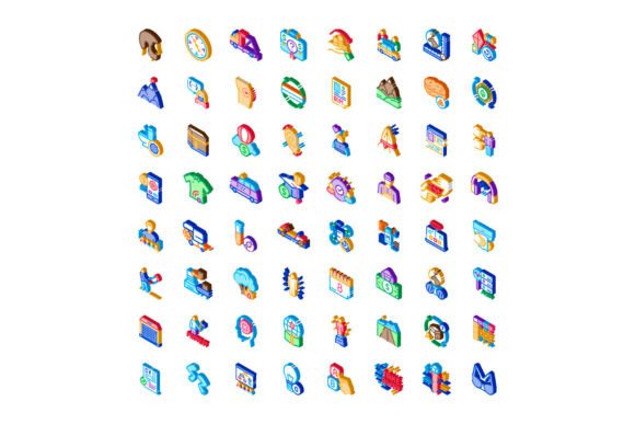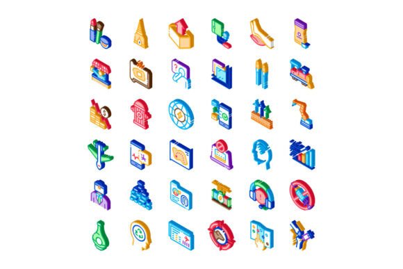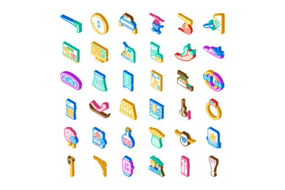
Isometric Vector Icons for Diverse Indus
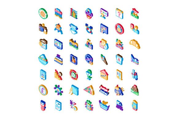
Isometric vector icons are more than just a visual trend—they’re a practical tool for clear, scalable, and consistent communication across industries. Whether you're designing an investor pitch deck for a health-tech startup, building an interactive travel app interface, or creating an educational infographic about sustainable food systems, isometric vector icons help translate complex ideas into instantly recognizable, dimensionally balanced visuals. Unlike flat or line icons, their 3D-like perspective adds depth without sacrificing clarity—making them especially effective in dashboards, presentations, and digital product documentation.
Why People Overlook Compatibility and Context
A common misstep is selecting isometric vector icons based solely on aesthetics—say, choosing a sleek “cloud server” icon because it looks modern—without verifying whether its visual language matches the rest of your design system. Isometric icons vary widely in angle (typically 30°), stroke weight, corner radius, and shading intensity. Mixing icons from different sets—even if they’re all labeled “isometric”—can create subtle but jarring inconsistencies in spacing, lighting direction, or scale. That mismatch doesn’t just look unpolished; it weakens credibility, especially in professional or client-facing materials.
For example, a small business owner building a healthcare website might download a free “stethoscope” icon from one marketplace and pair it with a “hospital building” icon from another source. If one uses soft ambient shadows and the other relies on hard directional highlights, users subconsciously register visual dissonance—even if they can’t name why. The result? Reduced trust, longer comprehension time, and weaker message retention.
What to Check Before Downloading or Buying
- Consistent grid alignment: Look for icons built on the same artboard size (e.g., 64×64px or 128×128px) and aligned to pixel-perfect baselines—not just centered loosely.
- Uniform perspective rules: Confirm that all icons follow the same isometric projection (e.g., 30° up, equal scaling on x/y/z axes). Some sets claim “isometric” but actually use dimetric or pseudo-3D approximations.
- File format flexibility: Prioritize SVG files with clean, layered paths—not rasterized PNGs masquerading as vectors. True vector files scale infinitely and integrate smoothly into Figma, Adobe XD, or web CSS.
- Licensing scope: Free downloads often restrict commercial use or require attribution. If you’re using icons in a SaaS dashboard or client brochure, verify whether the license covers internal tools, public websites, or embedded applications.
Mistaking Quantity for Quality
Some libraries market “5,000+ isometric vector icons for diverse indus” as a selling point—but volume alone doesn’t guarantee usefulness. A set with 200 well-crafted, logically grouped icons (e.g., “patient intake,” “lab test kit,” “telehealth call”) delivers more value than 2,000 generic ones (“box,” “arrow,” “circle”) repurposed across industries. When evaluating options, ask: Does this collection reflect real-world workflows—or just visual tropes?
Take food industry use cases: a strong set includes icons like “compost bin,” “farm-to-table timeline,” or “allergen warning label”—not just “apple” and “fork.” Similarly, tech-focused icons should go beyond “server rack” to include “API gateway,” “zero-trust architecture,” or “edge computing node.” These nuanced representations improve accuracy in technical documentation and reduce explanatory text overhead.
Ignoring Accessibility and Readability at Scale
Isometric icons introduce extra visual complexity—depth cues, overlapping planes, subtle gradients—that can hinder legibility at smaller sizes or for users with low vision. A common oversight is assuming that because an icon looks great at 96px, it will remain identifiable at 24px in a mobile navigation bar. Without proper contrast, simplified geometry, and intentional negative space, details blur or vanish.
Test icons yourself: shrink them to 20–24px, view them on a grayscale monitor, and ask someone unfamiliar with your project what they represent. If answers vary widely—or rely on guesswork—you’ve got a usability issue. Better practice? Choose sets that include simplified fallback versions or offer dual-mode variants (e.g., “detailed isometric” for hero sections, “outline-only” for compact UI elements).
How to Use Them Without Overcomplicating Your Workflow
Start with purpose—not decoration. Ask: What action, concept, or relationship does this icon need to clarify? An isometric “travel suitcase” icon works well beside a headline like “Your Itinerary, Optimized”—but not as a standalone CTA button labeled “Book Now.” In that case, a simpler “calendar + plane” combo or even plain text may communicate faster.
When integrating into infographics or reports, group related icons spatially and consistently: align bases on the same horizon line, maintain uniform spacing (e.g., 16px between items), and limit color variation to two primary hues plus neutral grays. This creates rhythm and hierarchy—helping viewers parse information in seconds, not minutes.
Underestimating Customization Needs
Off-the-shelf isometric vector icons rarely match brand-specific colors, tone, or terminology out of the box. Yet many users skip editing entirely—applying default blue fills to a fintech dashboard, even though their brand palette uses indigo and coral. That disconnect dilutes brand recognition and feels unintentional.
The fix isn’t always recoloring manually. Look for icon sets with built-in style guides or editable layers (e.g., separate fill, shadow, and highlight groups in Illustrator). Some premium libraries even include Figma plugins that let you batch-update stroke weights or swap out icon variants with one click—saving hours during rebranding or localization projects.
Also consider scalability beyond screen use. If you plan to print these icons on training handouts or trade show banners, confirm that strokes remain visible at large physical sizes and that gradients don’t dither or band when converted to CMYK.
Final Thought: Match the Tool to the Task
Isometric vector icons for diverse indus aren’t a universal solution—and shouldn’t be treated as one. They shine when clarity, spatial logic, and cross-industry versatility matter most: explaining supply chain flows, visualizing multi-step healthcare processes, or mapping software architecture layers. But they’re less ideal for minimalist branding systems or ultra-fast-scanning interfaces where flat symbols load faster and read clearer.
Your best move? Audit your actual use cases first—list the top 10 concepts you need to illustrate, note where they’ll appear (web, print, video, app), and define success (e.g., “users understand the workflow in under 8 seconds”). Then evaluate icon sets against those criteria—not against marketing claims or download counts. That grounded approach saves time, avoids revision loops, and ensures every icon earns its place.